This is a collection of my favorite articles I worked on as an employee of the For the Strength of Youth Magazine.
I've designed articles, hired and art directed illustrators, and given and implemented feedback received from
a multiple teams. I've also hired fine artists to create art that is now a permanent part of our catalogue.
I've designed articles, hired and art directed illustrators, and given and implemented feedback received from
a multiple teams. I've also hired fine artists to create art that is now a permanent part of our catalogue.
In an effort to provide scriptural art that is more historically accurate I commissioned two pieces of captain Moroni to go with the above article. I worked with correlation and with the artist to ensure the greatest historical accuracy. These images are now a part of our permanent collection and are available for reuse.
We saw a need in the magazine to provide a comprehensive overview of the Plan of Salvation. Within the artwork are three images of deity, three of the Savior and one of the Father. In order to ensure these images were in line with the current guidelines I worked closely with members of the correlation committee over the course of three months.
This article is about the hope we can find in difficult times. I wanted to represent this conceptually by showing the illustration of the storm peeling back to reveal brighter days.
This article talks about the mindset found in two different cities within the Book of Mormon. It invites the reader to consider which one they are most like. I wanted to invite the reader into the article with an interactive experience that reveals two different skylines. One when the page is in the expected orientation and one when you flip it to finish reading the text.
This article tells a story from two different perspectives. I wanted to add a conceptual element by showing scenes from each of the stories in each of the girls silhouettes.
This article invites the youth to consider how they are spending their time and how they are taking care of their bodies and their minds. In the true spirit of this article I worked with an editor to add the last evaluation page because I believed it would be more effective if we invited the youth to apply what the article taught.
This article encourages youth to rely on the strength of the Savior when dealing with the difficulties and temptations found in everyday life. Conceptually this is represented by the youth deciding weather or not they will hand the world over to the waiting arms of the Savior.
Worked with other designers to curate this collection of new images of the Savior that was presented in the March 2024 special issue of the For the Strength of Youth magazine. The approval and curation process took much time and effort and lasted nearly 6 months.
This article is an infographic intended to help youth understand what youth can do when they find themselves in a variety of stressful situations. My goal was to appeal to a stressed audience that might not have much time to read and so broke it up into bite sized sections with many points of entry.
Wanted to conceptually represent the title and show readers that just as the image wasn't complete without the Savior, neither is the gospel when we try to live it without Him.
My goal in this article was to show the living, changing and filling power of light that can come into our lives as we study the scriptures. Worked with an illustrator to create these custom unique light rays based on stained glass patterns.
My intent for this article was to show a familiar visual in a new way. Boats are used frequently in church media to represent the treacherous nature of life. I wanted to make it more youthful though and so decided to hire a paper cut illustrator to create and origami paper like scene.
This is an infographic to represent a familiar parable, but shown in a way that was intended to open
them up to new considerations.
them up to new considerations.
Once again I wanted to engage the reader by creating an experience where they had to interact with the direction of the magazine. The first spread requires you to hold the magazine vertically, and the second spread requires you to go back to a horizontal view.
My coworker and I found these two youth at FSY and I art directed the photoshoot for their story that I also later designed.
With the advent of the new For the Strength of Youth Guide, we have been working hard to understand how to help the content appeal to the intended audience. Because these article contained examples of specific examples of how you might use the guide in conversation I decided to break out of the traditional text flow and turn those parts into a comic that would hopefully allow readers easier access to the content.
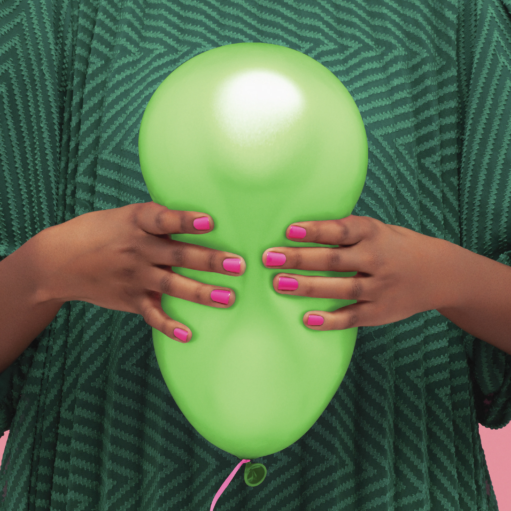
For this piece I wanted a powerful visual representation of what it feels like to fail.
A beautiful photo story that I decided to add minor illustration details to. These illustrations are all native flowers from her country and were intended to magnify the beauty and spirit of her story.
For this short article I was once again trying to think of how to get youth engaged in a particular article. The scenes on the
left are all examples of ways you can feel the Spirit or hear the Lord's voice and the idea is to match them to the people they belong to on the right.
left are all examples of ways you can feel the Spirit or hear the Lord's voice and the idea is to match them to the people they belong to on the right.
Because David and Goliath is such an action filled story I decided to enlist an illustrator who was able to mimic the minimalistic, yet brutally beautiful style of Saul Bass.
A photo story of a young man from Malaysia. I worked with area liaisons to find an artist who was able to create the illustrations of authentic Malaysian patterns.
This is sheet music we provided in the magazine for a popular youth theme song.
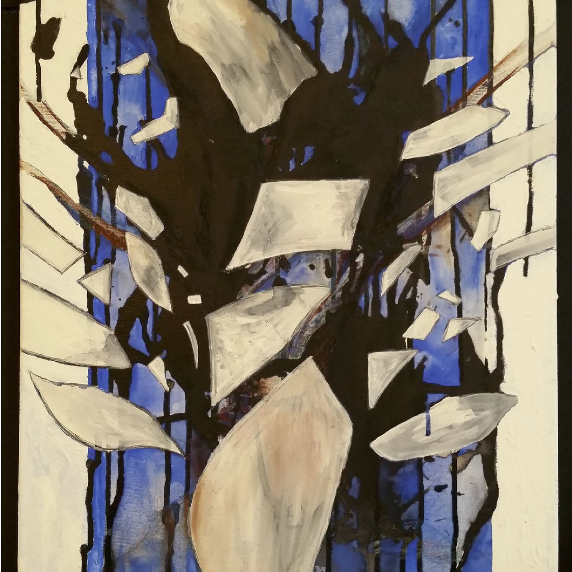
For this article I found the piece of art located on the very first page. Prior to my discovery it had never before been used in Church media and is now a part of our media library.
This article was intended to show the isolating properties of many mental illnesses that are not always obvious.
Found an artist who created this custom temple illustrations and worked with temple department to ensure they were appropriate for church use.
This article is about a missionary who struggled with feelings of failure as he served a two year mission for the Church of Jesus Christ of Latter Day Saints. Many years after the fact he realized that he hadn’t failed because he had worked hard and done his best. I wanted to provided a visual that would allow youth to connect with this feeling and idea even though they themselves had never experienced serving a mission. I think as a teenager it is easy to feel like a failure and so I wanted the reader to immediately connect with that feeling in a striking visual so that they would be drawn into the article and find that often a perceived failure is actually just part of a bigger picture.
This article is about how talking about Jesus Christ can be part of your daily life. Because of this I wanted the story to have a very conversational feel. This is why I put the elements in speech bubbles and left characters in in the title free floating. I wanted everything to feel very welcoming and open, just like a conversation about the Gospel can and should be.
One thing I really love to do as a designer is break out elements of the story in unexpected ways. This story takes place in a very rainy setting so I thought it would be fun for the text to be in a rainy setting too! I think it’s important as a designer to play with expected visuals in unexpected ways that are familiar but also surprise and delight.


